Make it Easy
Designing a Multi-Brand Tablet Ordering System for the Restaurant Industry
Tablet
Android App
Multi-Brand Design System

Year
2020
My Role
UX/UI Designer
Team
1 - UX/UI Designer
1 - Product Manager
1 - Front-end developer
1 - Back-end developer
Tools
Figma
Miro
Notion
Whimsical
Client

Challenge
Most restaurant digital menus in 2020 were QR code redirects to static PDFs, frustrating, slow, and completely disconnected from the ordering and payment flow. Make it Easy was built to change that: a native tablet app that lets customers browse, order, track consumption, and split the bill, all without staff intervention. As the sole designer, I owned the product experience end-to-end, from research through final handoff.
Implement a white-label solution that enables restaurants to incorporate their branding, customize features, and adjust settings according to their specific needs and business requirements.
Ensure the app provides all the necessary information and tools for customers to place orders quickly and easily, without requiring assistance from restaurant staff.
Develop a digital menu that offers restaurant consumers a modern and efficient way to order food.
Create a tablet app with a clean, reliable, and visually appealing interface.
Competitors Analysis
We analyzed the behavior of both direct and indirect competitors to gain insights into the features and experiences they offer.


What we learned from leading competitors
Some apps allowed users to call a waiter directly from the table
Few offered order-ready notifications via push
Only one competitor enabled bill-splitting between table members
Most lacked a polished and usable interface
These findings directly shaped our MVP scope: we prioritized bill-splitting and per-person order tracking, features no competitor had combined in a single, polished tablet experience.
User Interviews
5 People interviewed
The interviews focused on understanding people's routines in restaurants, aiming to gather insights into their experiences and needs.
"I dislike digital menus accessed via QR codes on my cell phone. They’re confusing and rely on my internet connection."
"It can be cumbersome to determine who ordered what when it's time to pay the bill."
"To keep track of my consumption, I jot down all my orders on my cell phone and review them when the bill arrives."
"I prefer seeing large photos and detailed descriptions of the food on the menu."
"I visit restaurants daily during my lunch break, so I appreciate a quick and efficient ordering process."
"I always look for deals at restaurants to save money."
Personas
Based on patterns in user behavior and common traits identified from the user interviews, we created two personas to guide and focus our upcoming design efforts.


Prioritizing
The 2x2 Matrix helped us identify and prioritize the essential features for our MVP, allowing us to focus our efforts more effectively.

2x2 Matrix
Features selected for the MVP
Option to call the waiter.
Flow to rate the experience of the app, restaurant, and food.
White label.
Table service.
Highlights and promotions.
A page of news and advertisements.
Notification to pick up the order at the counter.
Identify who ordered each item.
Bill splitting.
Sitemap
We used the sitemap to gain an overview of the entire app, which helped us understand the project's complexity and scope.

Wireframe
I created a wireframe to define the content placement and structure for each page, providing the team with a clear overview of the final design's layout.

Styleguide
A set of standards was provided to developers to streamline the product creation process and minimize inconsistencies across the pages. The app used the company's brand colors as its default palette, but as a white-label solution, it allowed restaurants to customize the primary and secondary colors to match their own branding.


Usability Testing
REMOTE WITH 5 PEOPLE
Rather than shipping based on assumptions, I ran remote usability tests with 5 participants using a high-fidelity Figma prototype. Each session was task-based, focused on the two most critical flows: placing an order and splitting the bill. The findings led to 4 significant design improvements before any line of code was written.


Tasks
Each user was assigned two tasks, carefully chosen to evaluate the most critical features of the application.
Task 1
Find a specific item on the app and place the order, specifying who is placing it.
Goals
Observe whether the flow and components are clear and intuitive.
Assess if the process of adding items and indicating who is making the request is understandable.


Task 2
Request the bill, select the person responsible for paying the partial amount, and provide feedback at the end.
Goals
Observe whether the flow and components are recognizable and intuitive.
Test if the process for selecting who wants to pay is clear.


Improvements
By conducting the test, we gained valuable insights into user behavior and preferences, which guided us in refining and enhancing the user experience.
Improvement 1
Users struggled to associate their identity with items in the cart. Restructuring the item detail flow reduced confusion and made the 'who is ordering' mechanic immediately clear.
Before

After


Improvement 2
The original order management screen mixed all items regardless of who ordered them. Grouping by person reduced cognitive load and made bill-splitting feel natural instead of laborious.
Before

After

Improvement 3
Users found the payment flow unclear, struggling to understand the sequence of steps. By reorganizing the screen elements and reducing visual noise, I created a more linear and predictable flow, making it easier for users to complete transactions confidently and without hesitation.
Before

After

Improvement 4
Users found it frustrating to navigate between separate pages to rate the app, the restaurant, and the food. Consolidating all feedback types into a single screen eliminated unnecessary navigation and created a more natural closing to the dining experience, increasing the likelihood of users actually completing the rating.
Before

After

Waiting screen
During standby, the tablet will display information and advertisements selected by the restaurant.
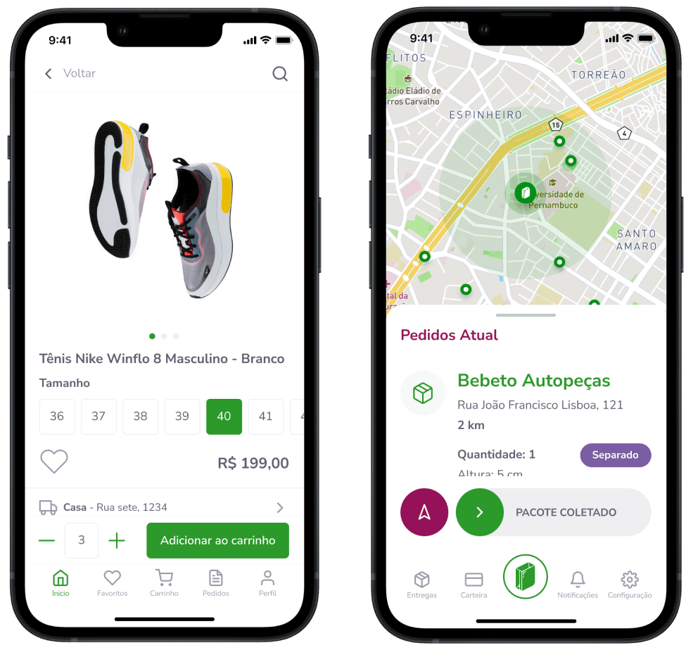
Item details
Here, users can view details of the selected item, item options, and extras.
Home and Products list
This is the first screen that the client sees. Here, they are introduced to the app for the first time. We created a clear layout with the essential information that they could need.
Who is ordering
Function designed to identify who placed each order and assist with splitting and paying the total or partial bill.
Notification
Automatic notifications will be sent to inform when the order is ready for pickup at the counter or any other messages sent manually by the restaurant.

The app allows for color customization to match different brand specifications and the flexibility to toggle functions based on restaurant needs. At the same time, it ensures consistency, high usability, and compliance with the minimum standards for Google Play Store approval.


Impact and Retrospective
What was delivered
As the sole designer, I owned the full product experience, from research to final handoff, delivering a usability-tested, white-label tablet ordering system ready for multi-brand deployment.
Retrospective
Building a white-label system taught me that flexibility and consistency are in constant tension. And looking back, my research was too stakeholder-driven. Today I'd spend more time with the customers at the tables than with the restaurant owners.